The image above helps me to explain the idea/concept i had behind the meeting space. The meeting space was to be the joining of the two worlds in which the two clients live - those being the fashion and business. A key underlying idea of the room was to create new birth or in some cases re-birth of ideas. This is seen from a special element of the meeting space, and that is the flowing water that surrounds the room. The reason why this is such a special element is that it symbolises the idea that water is the source of life and by having it surround the building it is providing a constant and everlasting source of ideas for the clients. But it is also duel purpose. It acts as a relaxation tool. This was another important issue in the design of this building, as i wanted the meeting space to be the area in which the two clients could part with their busy worlds and just take personal time and relax from the stresses of their everyday life. A place of tranquility.
Above is an image which shows some sculptors i have created and imported into UT2004 and into the meeting space.

 Above is an image which shows my mesh being used a source of light within in the meeting space.
 The above image shows a shot from the outside of my meeting space looking in towards the interior.
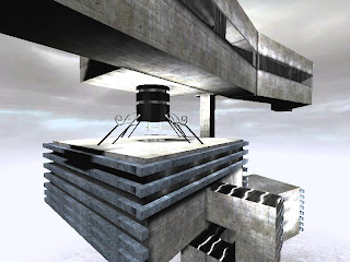
 The above image shows an over head shot of my new elevator. From this shot we are able to see the extent of the curves which penetrate out of this elevator. The idea for this is that it is meant for Donatella Versace, and i wanted to design a lift which is like a palace and represent elegance and grace.
 The above image shows the use of lighting to create depth within the space.
 The above image shows the various levels within the below clients space. In this case it is Zhang Yin's space. (still developing)
 Above is an image showing how in this building i am keeping in mind the issue that the client will be working in this space and so safety needs to be a priority in order to ensure a productive and happy client.
Reason behind the spaces forms:
In my piece of architecture each space has a unique meaning behind why each form is designed in that way, both internally and externally.
Exterior:
In the case of the exterior i designed it to look like a mix between a modern office block and a futuristic creation of art. The meaning behind this is because i wanted to display the idea that was put forward by Theodore VonKármán, (c.a. 1957), that ``Science is the study of what Is, Architecture builds what Will Be.''
Also the exterior was designing to be relatively plain and uninformative. This was done as in today's societies, and strongly in the clients, there is strong emphasis on appearance but also on the secretive nature in which their work revolves around. So it has been designed to look plain but when entered inside it takes on a completely different personal from the one being previously displayed.